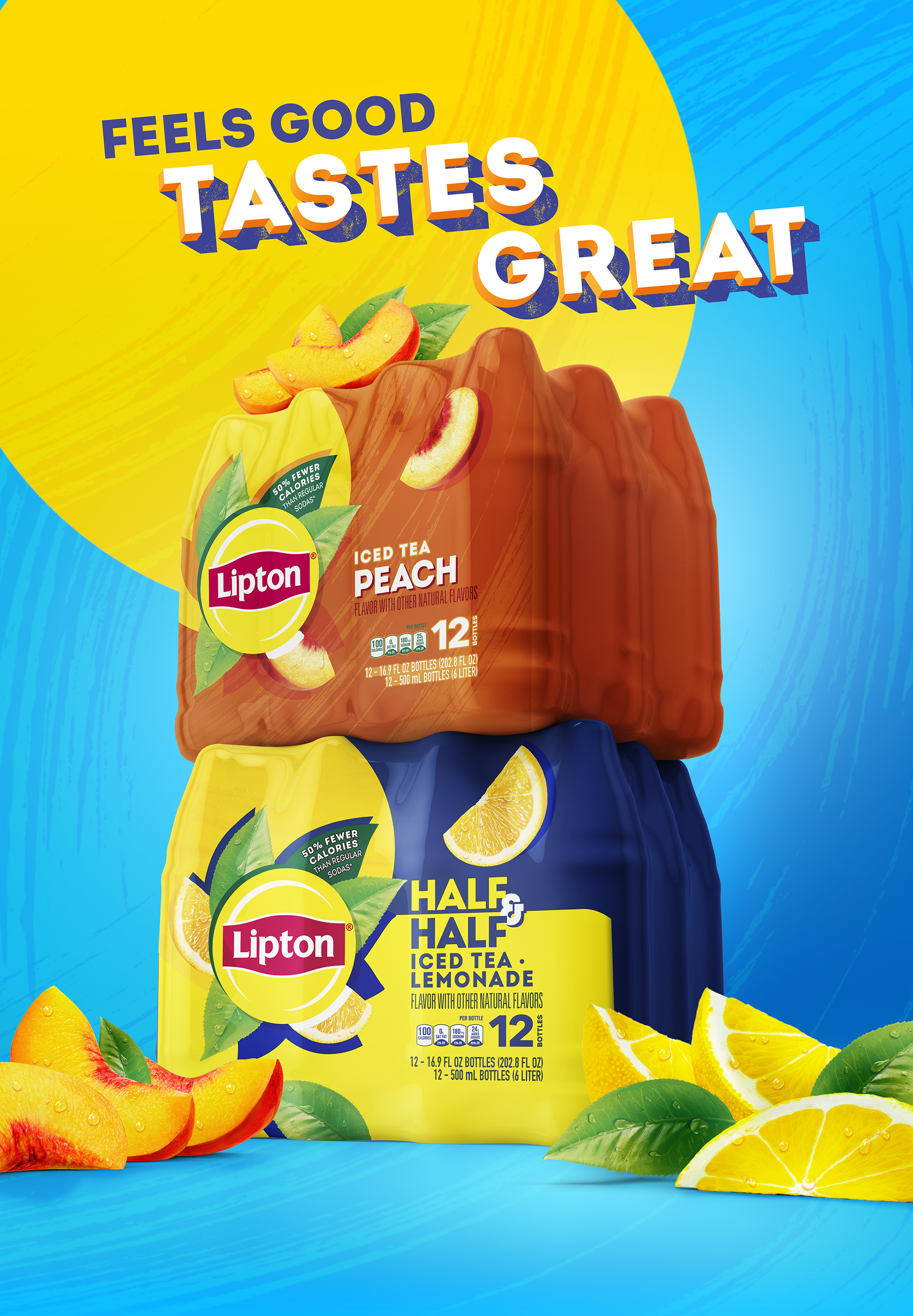
Lipton
CGI
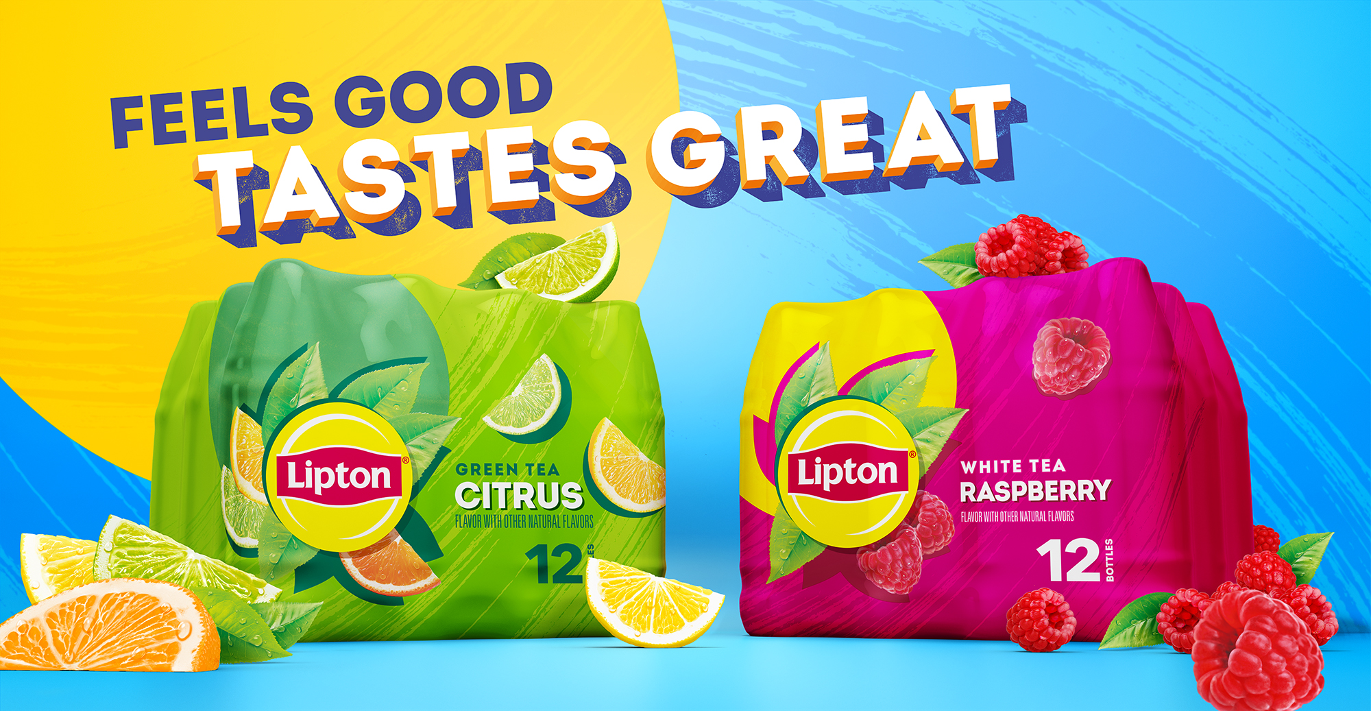
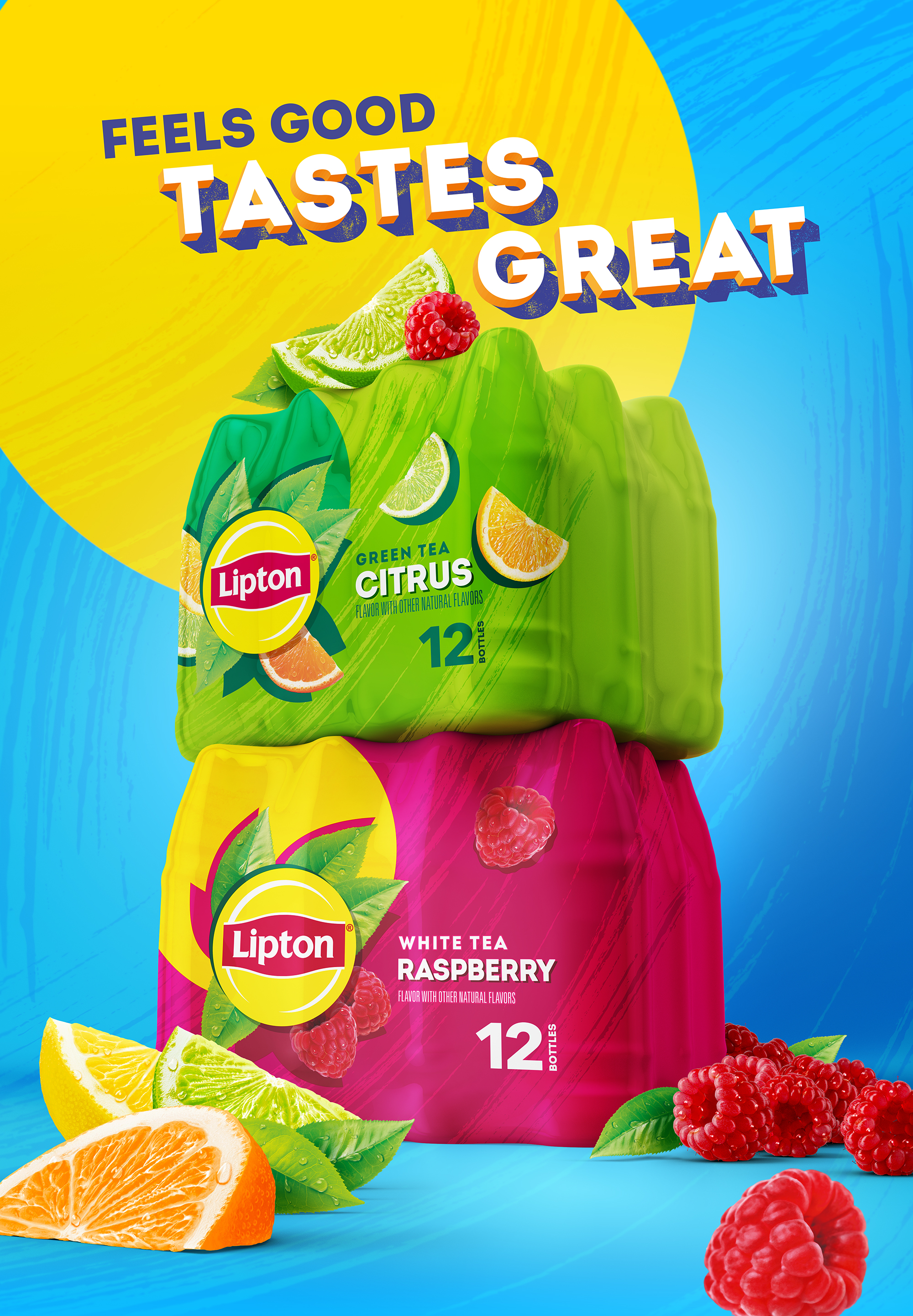
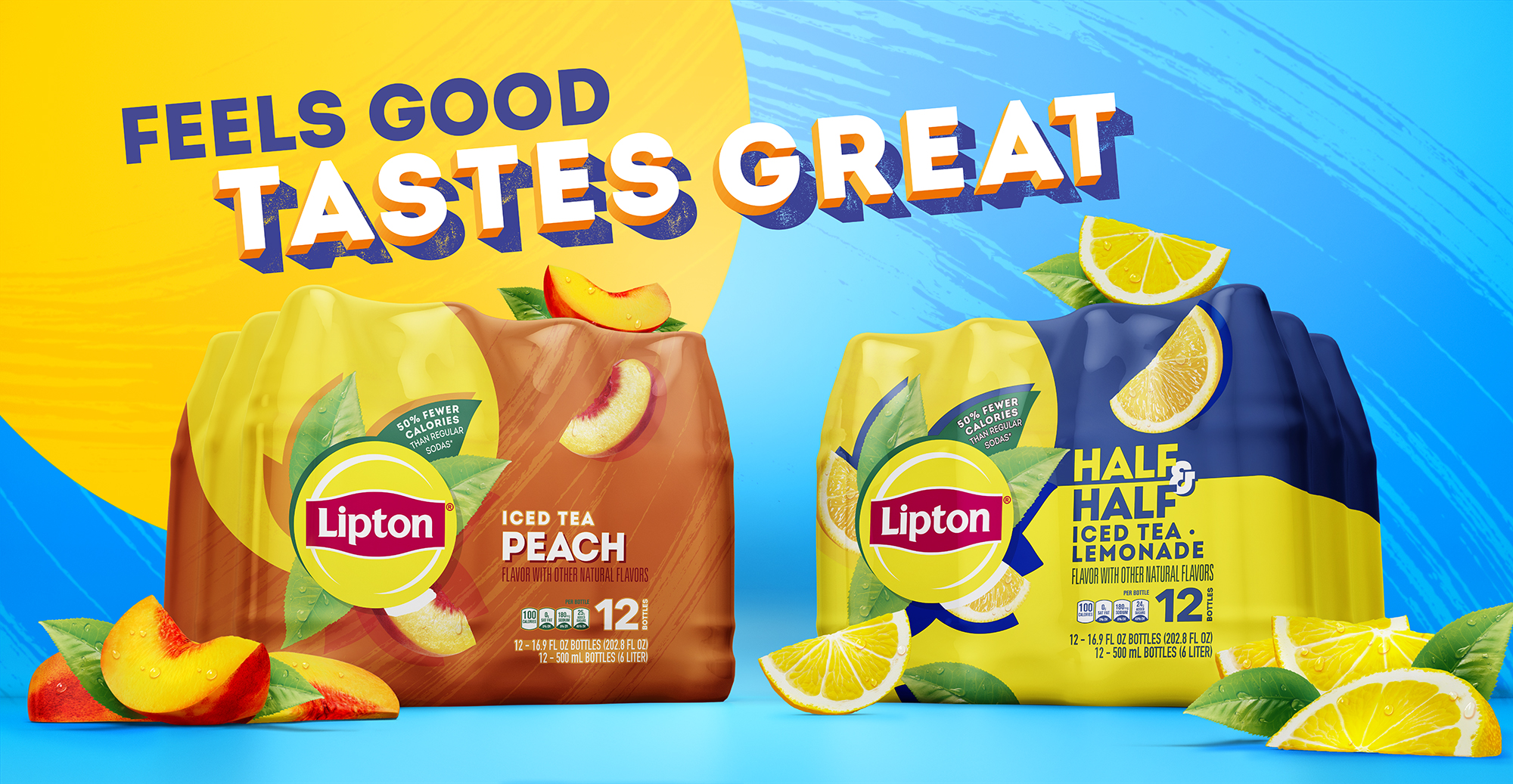
‘Despite having a bespoke cut of Intro, Lipton Ice Tea lacked an iconic font that felt ownable to the brand which was suitable for use throughout the brand world globally. We were briefed to create an impactful typeface that would ensure a level of recognisability and consistency across numerous markets, languages, alphabets and product flavours.
Our solution was to create a font which is reflective of the brand’s bright optimistic image and purpose that can adapt to different languages and alphabets whilst retaining its recognizable essence and sunshine feel. Rather than utilizing several fonts within the brand world, we playfully combine use of multiple cuts with colour and scale to add pace and impact across a diverse global brand world.’
Work created at Design Bridge.
